Poloniex
One of crypto's largest exchanges. I led the redesign of the entire platform - website, iOS, and Android - built the margin trading product from scratch with engineering, and rebuilt internal tooling.
Overview
Poloniex is one of the largest crypto exchanges in the world. For 2 years I owned three big pieces of the product: a complete redesign of the customer-facing exchange across web, iOS, and Android; a brand-new margin trading platform built from scratch; and the redesign of the internal tools.
It's a high-stakes, high-volume product. People trade real money on it around the clock, so clarity and trust aren't polish - they're the job.
Redesigning the exchange
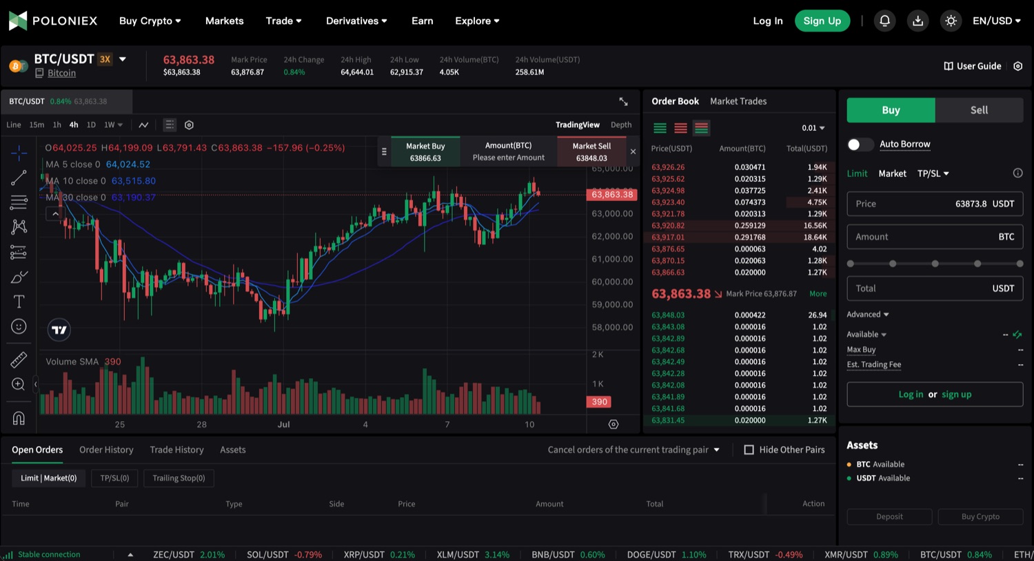
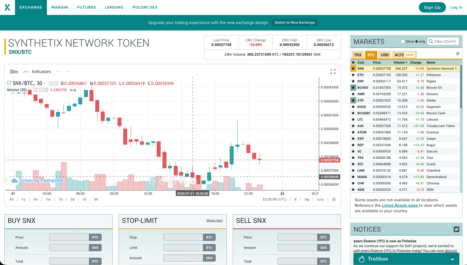
The exchange had grown into one of the biggest in crypto, but the product had aged in place - a dense legacy web app traders tolerated more than enjoyed. I led a full redesign of the entire platform: the website, the iOS app, and the Android app, all rebuilt around one modern trading experience.
Redesigning a live exchange is delicate. Traders move on muscle memory, so every change has to earn its place - modernize the look and the flow without slowing down the people who live in it all day.
A new margin trading platform
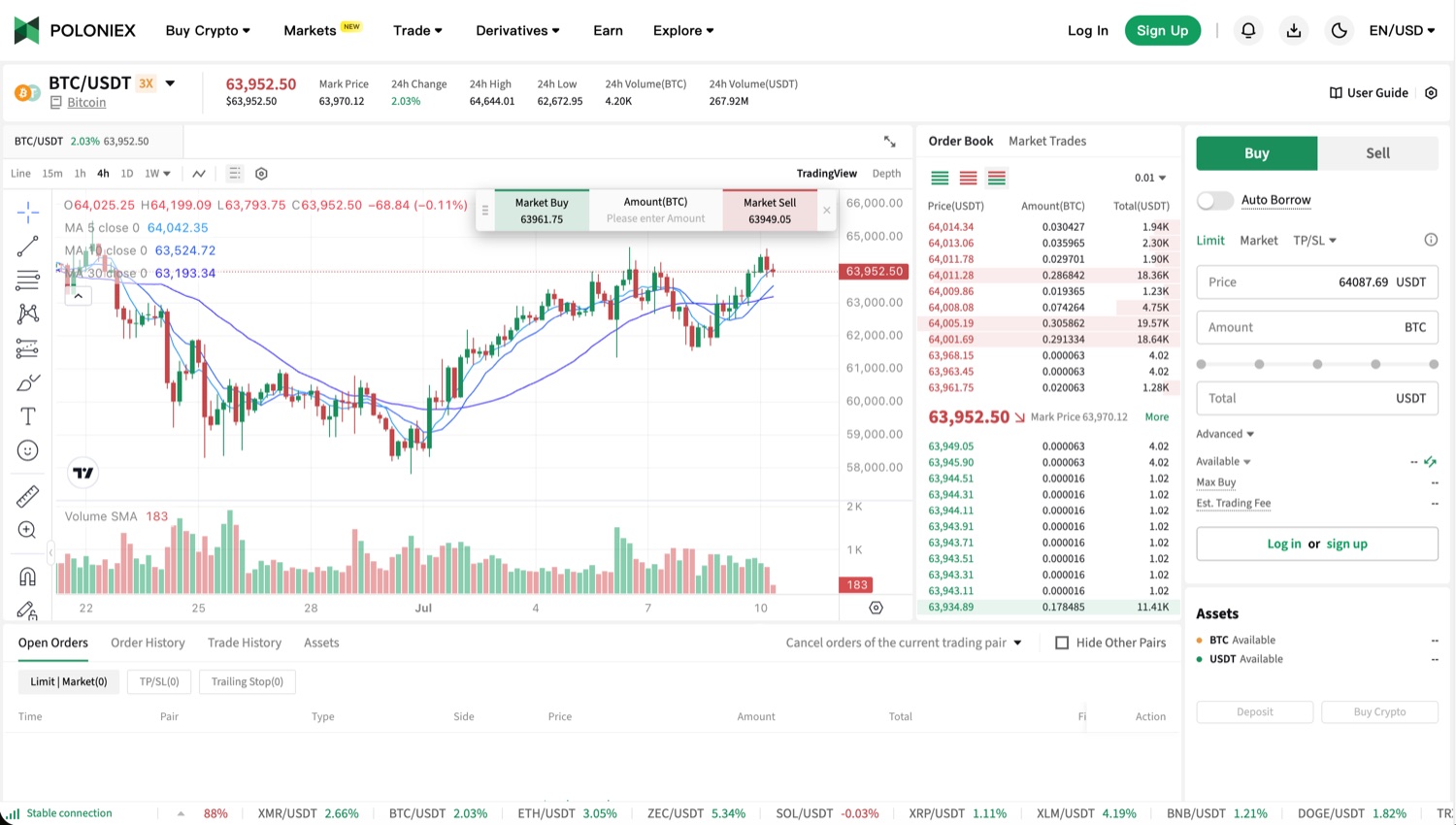
Margin trading was a major new capability for the exchange. I designed and shipped the entire product, from onboarding and account setup to the trading experience itself, bringing a complex, high-stakes financial product to Poloniex in a way everyday traders could use with confidence.
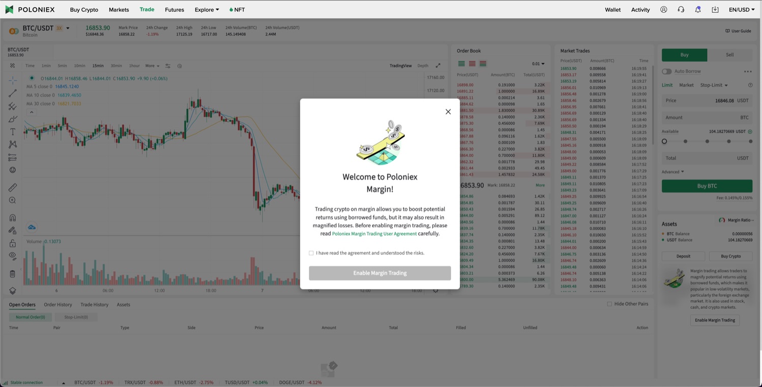
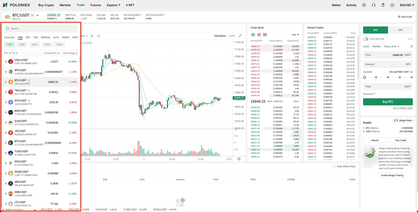
A big part of the win was the trading view itself. I turned the fixed currency menu into a dropdown, reclaiming a whole column of real estate - so the entire view could breathe, stay easy to read at a glance, and make room for a much larger chart.
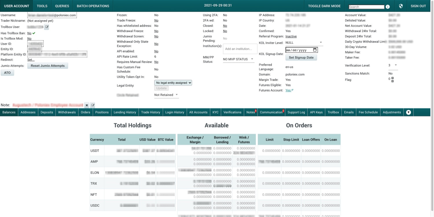
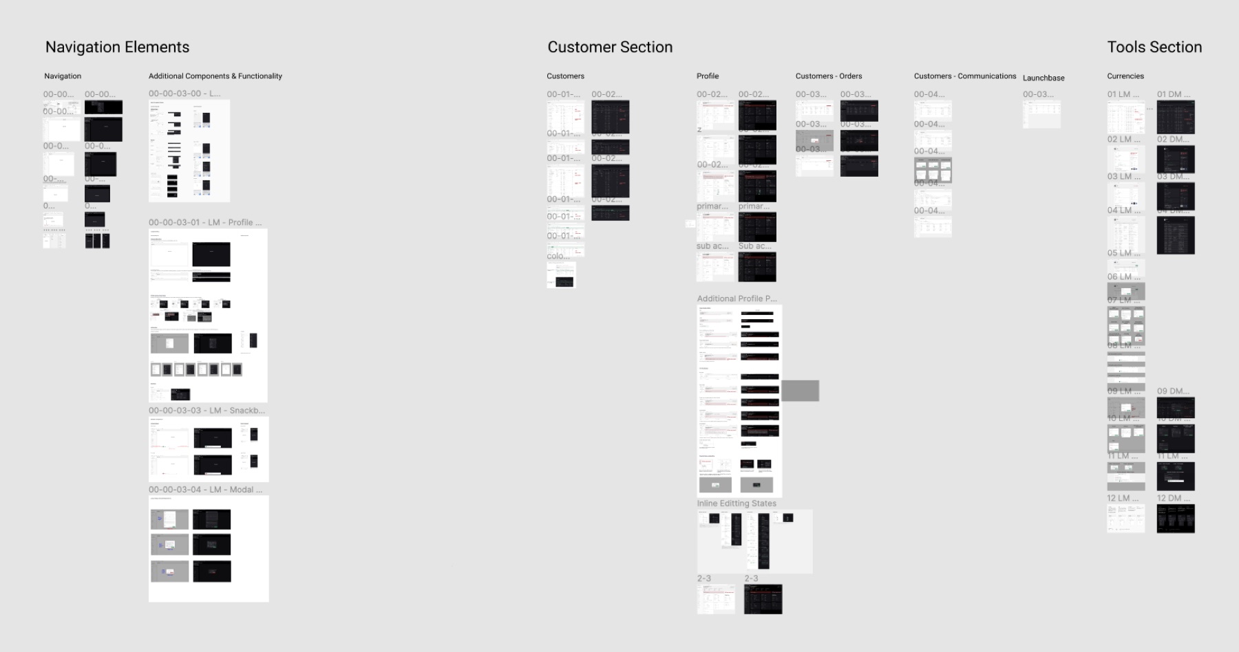
Polaris - the internal platform
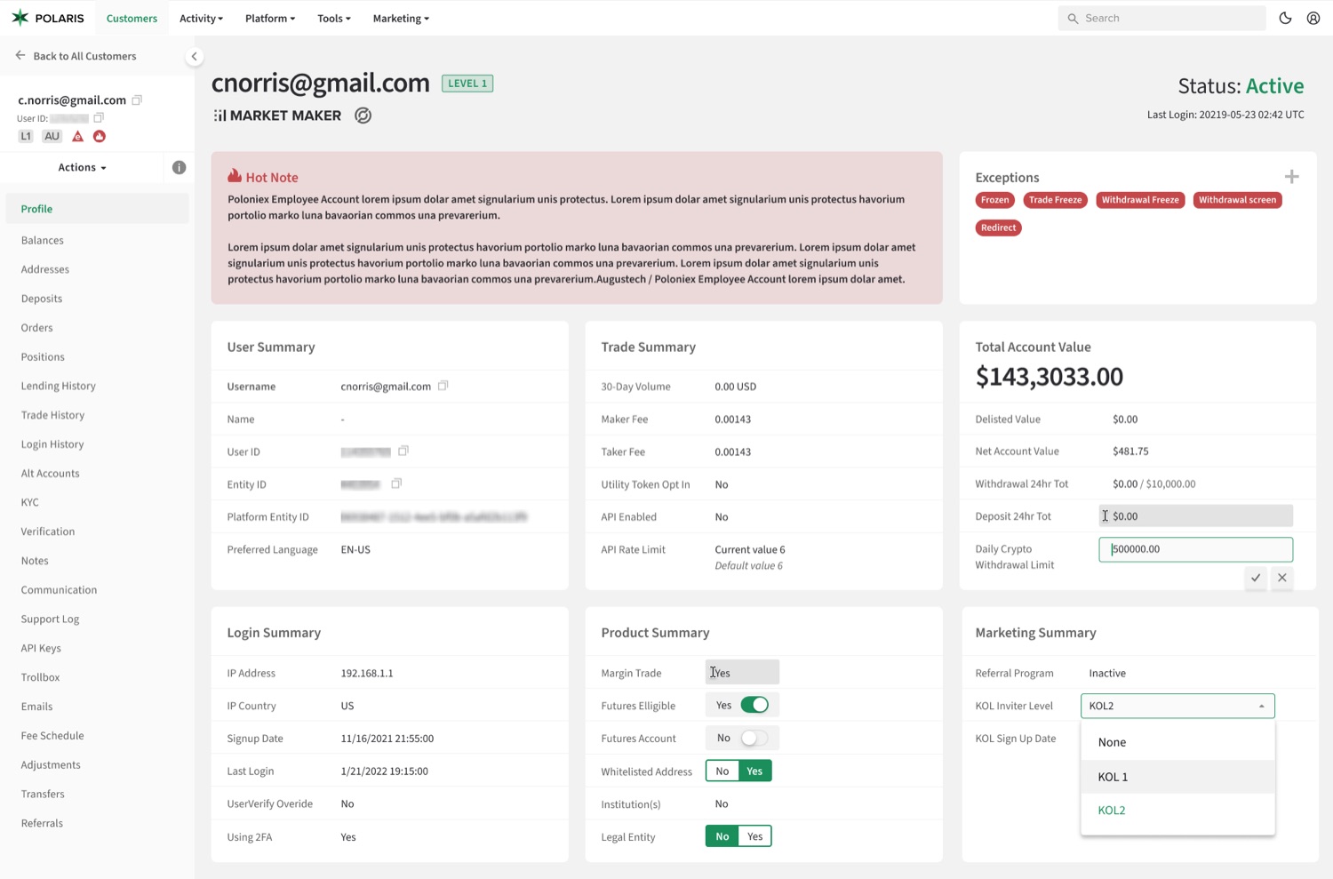
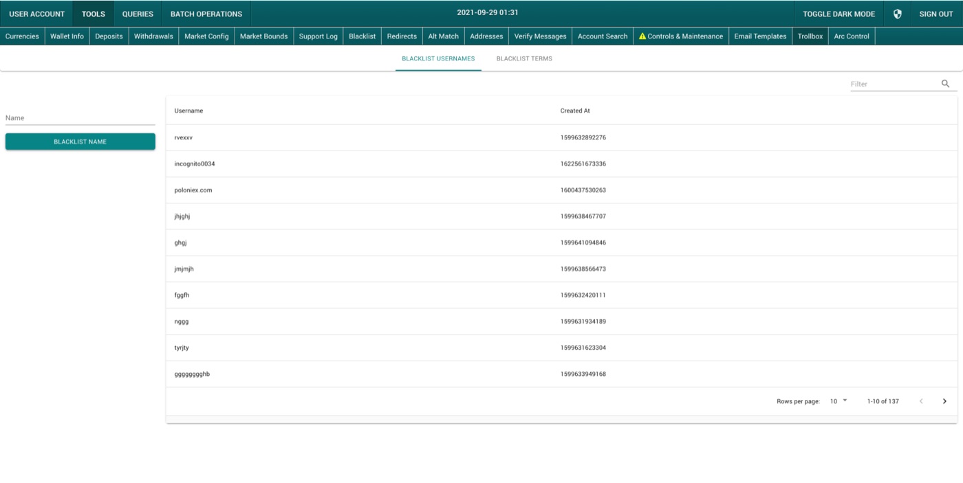
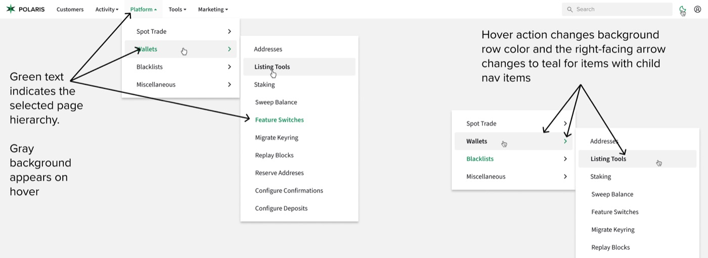
The teams running the exchange - customer support, wallets, operations - worked all day inside a homegrown admin tool that had grown tangled over years of bolt-on features. I redesigned it end to end and relaunched it as Polaris: a new information architecture, navigation that puts the most-used tasks a click away instead of two, and a reusable design framework spanning the whole application.
I interviewed the people who lived in the tool, mapped the pages and tasks they hit most, and rebuilt the core screens - the customer profile, the currency tools - around clear summaries and inline actions. Polaris became the platform the company runs on, and the backbone the margin launch shipped on top of.